

Habitat Design System
My Role
As the Lead Product Designer of the Design System & Brand team, I directed the design and creation of Berkadia's own design system


The front-end experience at Berkadia was inconsistent, both in design and development practices.
Due to our previous work standardizing and creating efficiencies in the marketing department, my team was recruited to define and build a solution for Berkadia’s innovation organization.
Audit
We started with a visual audit to highlight our biggest inconsistencies and common needs for each product. This involved taking screenshots of using each product through common user flows, categorizing these screenshots by action, and creating collections of individual components to get an idea of current variations. The audit helped us prioritize components needed across multiple products.

Core
Building upon the insights acquired from our initial visual audit, we transitioned into the core theming work. This comprehensive phase encompassed critical elements, including color, typography, spacing, icons, and essential structural components. Serving as the foundation of our entire design system, this phase was meticulously developed. The theming work aimed to establish a unified and harmonious visual language throughout our product suite, laying the groundwork for the creation of consistent and user-centric components.


Color
Spacing

Icons
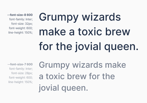
Typography
Component Library
Each of our 35+ components were designed to ensure consistency and efficiency in our product design. The Figma library includes detailed documentation for every component, showcasing its various states, sizes, and thematic variations.

Pattern Library
During our product design team meetings, designers brought forward the challenges they faced in ongoing projects. As a committee, we collectively discussed and determined the guidelines needed to address these challenges. These guidelines were then added to the Pattern Library in Figma, complete with documentation and examples. This collaborative approach ensured that our Pattern Library remained a dynamic and responsive resource, facilitating consistent user interactions as we evolved.
Documentation & Maintenance
In addition to the design documentation we included within the Figma files themselves, we also built an internal documentation site containing design specs for all components, patterns & theming information, icon library, code repository, training videos, how-to guides, and mockups of products.
I also hosted a weekly Habitat Office Hours for designers to bring up any questions, problems, or requests for adding or changing elements in the system, which became a valuable source of feedback and continuous improvement.

Designers

Developers
Results
-
10
products aligned to brand standards
-
70%
reduction in product launch spend
-
0→296
active design system community members